
FNCK Fragrance
A bold brand identity for a modern fragrance label, built around a sharp monogram and a confident black-and-red visual language.
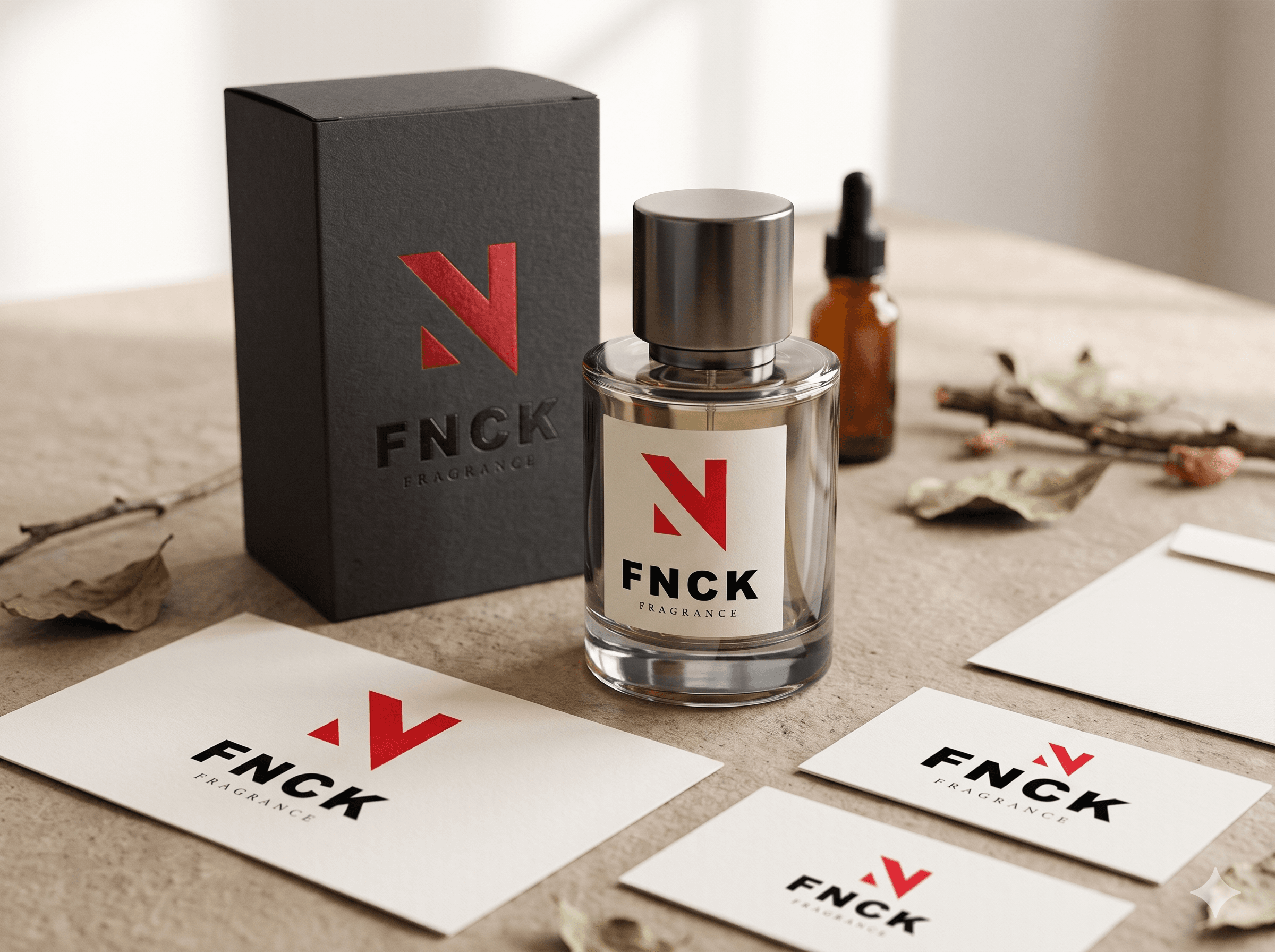
Giving a bold fragrance a brand identity to match.
FNCK needed an identity that could stand apart from traditional fragrance labels and speak to a younger, style-conscious audience. The challenge was to balance attitude with refinement, creating a brand that feels daring and memorable while still earning its place in the premium segment.
THEY WERE STRUGGLING WITH:
- Needed a distinctive identity in a highly competitive fragrance market.
- Required a simple, recognisable mark that works on bottles, packaging and digital platforms.
- Had to appeal to a modern audience without losing a premium feel.
- Needed a flexible logo system that holds up across sizes and applications.
Giving a bold fragrance a brand identity to match.
FNCK needed an identity that could stand apart from traditional fragrance labels and speak to a younger, style-conscious audience. The challenge was to balance attitude with refinement, creating a brand that feels daring and memorable while still earning its place in the premium segment.
THEY WERE STRUGGLING WITH:
- Needed a distinctive identity in a highly competitive fragrance market.
- Required a simple, recognisable mark that works on bottles, packaging and digital platforms.
- Had to appeal to a modern audience without losing a premium feel.
- Needed a flexible logo system that holds up across sizes and applications.
Build an identity as confident as the fragrances it represents.
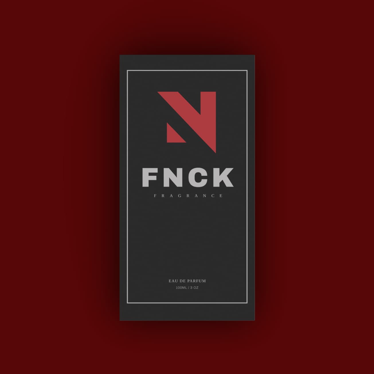
The identity pairs strong, geometric forms with a refined typographic contrast. A high-impact monogram and a heavy wordmark carry the brand's attitude, while a delicate serif descriptor adds a touch of elegance. The result is a brand that feels bold, modern and distinctly premium.
Angular Monogram
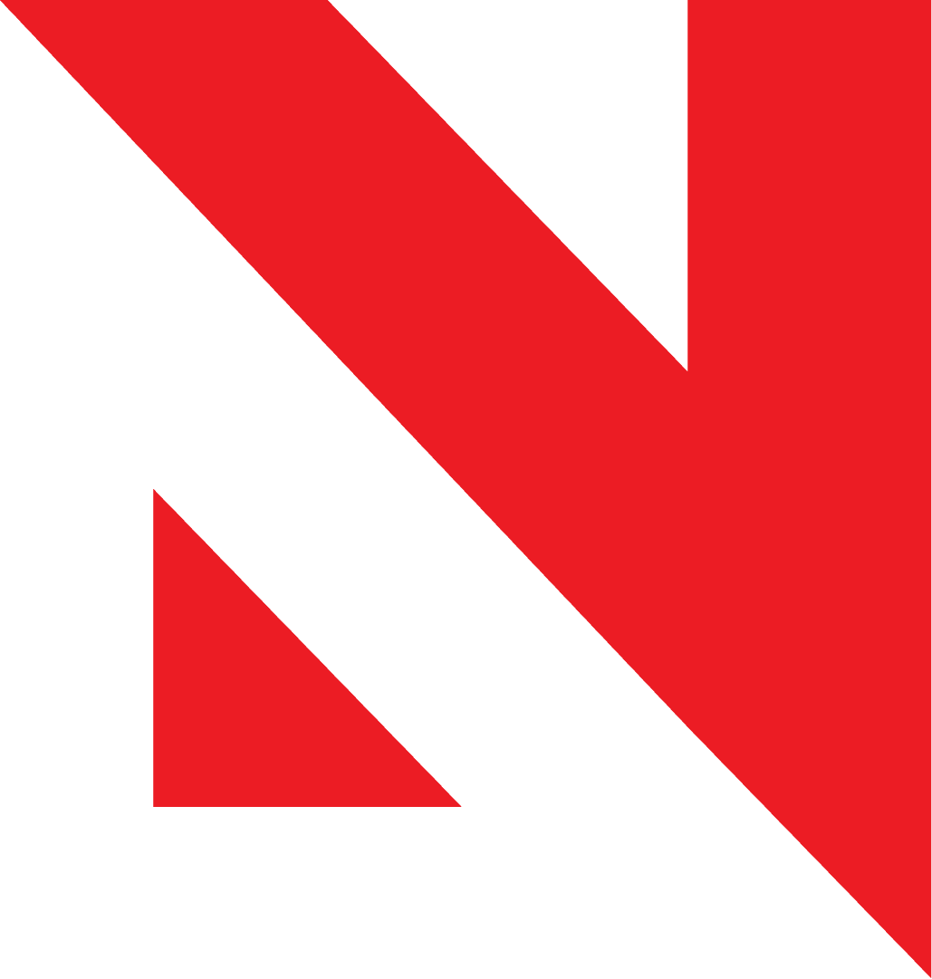
Designed a sharp, geometric "N" built from bold diagonal forms that gives the brand a memorable symbol.
Heavy, Confident Wordmark
Set the FNCK name in a wide, heavy typeface that commands attention and reads clearly at any scale.
Typographic Contrast
Paired the bold wordmark with a light, widely spaced serif "FRAGRANCE" to bring balance and a premium touch.
Black and Red Palette
Used a striking red against solid black and white to create strong contrast, instant recognition and a bold shelf presence.
An identity as bold as the name.
The identity was created as a flexible system, with a vertical logo lockup for primary use and the monogram as a standalone mark for packaging, social media and brand details.
A brand built to make an impression.
The new identity gave FNCK Fragrance the visual authority and market presence needed to stand out in a crowded perfume category.
Distinctive Brand Presence: Established an identity that stands out clearly in the fragrance category.
Instant Recognition: A simple monogram and strong colour palette make the brand easy to remember.
Versatile Logo System: Works across packaging, print and digital in both full and compact formats.
Scalable Brand Foundation: Built to support future fragrances, collections and brand growth.
Had a really good experience working with Dhvanil. He understood what we were looking for and came up with a branding concept that suited our perfume brand perfectly. I really liked how he paid attention to the little details and kept the overall look clean, premium, and elegant. Communication was smooth, he was open to feedback, and the final outcome was exactly what we had in mind. Would definitely recommend working with him!
Ready to create something extraordinary?
I look forward to learning about your business and helping you create something extraordinary.
START A PROJECT→